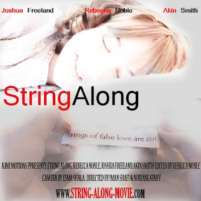
what is different to other versions of this poster is that i did include more of the bottom image with the fortune sentence in the hands of Delilah.
i liked making the poster more compact by including more of the image to signify that their is alot going on in the film, it is full of events etc..

the difference in this image compared to the first one is the bottom image of the fortune has less opacity and the hands are faded out more
i have used font with red against black as it stands out, relates to the red string, and the dark ending (black), i was inspired to use this idea by the film posters of 'Last Night'

the difference in this poster is that the image of Delilah is less faded, more opacity and average contrast with little brightness change, so this image is similar enough to how it was taken in the first place
This is another poster i had composed, the font has been selected at random but with consideration of other similar genre'd film posters and to the style of the film.
the font is smooth, reflecting on the string being smooth and long, if u image the words being the string it looks like a muddled, curved and bended string, this is essential to the reflection of the storyline, Also the fact that it is also in Red against black matches with other writing in the poster and the red string itself featured in the film.
In this poster i smudged the line between the two images to merge it together more, and to also give the effect of her sleeping on the sheets with the uneven line and softness of the edging.
whereas in the version of this poster below i have not smudged the lining between the two images together this is because i wanted to see the difference in look and to experiment which one looked better and suited more. Feedback (from target audience, 17 year old female) said that the smudged poster was better as the two images seemed more intergrated and together, whereas the version below seemed too abrupt, although it is still good and suits just the first version worked better.

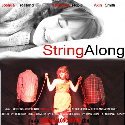
This poster is another draft similar to the one above however it is in black and white but the text is purposely in black/red/white.
my problem with this is the look came across outdated and not modern enough, which doesnt match the film, Delilah is a character who is placed in the context of our modern world and she herself is modern. also it looked abit like scarface posters as you can see below... however, this was just an experiment enabling me with a variety of ideas and making sure i tap into all possible styles, effects and features to make the perfect poster for my film.

This is the scarface poster, which after i made my poster i realised how similar it looked to this poster i once saw, which was years and years ago. this also made me realise that i cannot have a poster similar to this style because a popular poster like this sticks in many peoples minds even if they did see it long ago! Therfore i didn't want to confuse our audience and suggest it being a gangster action film as that is the complete opposite to my genre and also my audience, my intended audience are not boys and men but women and teenagers (mostly female teens).

This is the scarface poster, which after i made my poster i realised how similar it looked to this poster i once saw, which was years and years ago. this also made me realise that i cannot have a poster similar to this style because a popular poster like this sticks in many peoples minds even if they did see it long ago! Therfore i didn't want to confuse our audience and suggest it being a gangster action film as that is the complete opposite to my genre and also my audience, my intended audience are not boys and men but women and teenagers (mostly female teens).
This was the First poster i created. i liked it very much but i did think it looked slightly messy with the fades. however from feeback (female age 17, which is the age within my target audience) suggested that it looked proffessional and she agreed with the way the poster was devised. However, somthing did not seem quite right, the font at first when i pictured it in my mind would be suitable, elegant and would be suitable in targeting females with the italic scripture font. However with the scripture font and the black and white background it imposed an outdated look, almost like a film which the story revolves around the 'past' of some sort and the scripture suggest it being a film to do with letters, love notes, and elegance. This may have seemed to confusing for the audience as their expectations of the film it's story and elements wont't match to the actual film when they see it. Also contrast was too hard of the image so the text whether it was black or white wasnt clear enough to see at the bottom. The idea of using the colour red did come to mind but when i experiemented with it, the film poster fell into a horror and again scarface style genre.


No comments:
Post a Comment